Impact Estimation Tables as a Practical Input to the X-Matrix
Tom Gilb’s Impact Estimation Tables and the X-Matrix have different heritages, yet one can quietly inform the other’s correlations. Here’s how.
Karl Scotland – Using Agility Strategically
Karl Scotland – Using Agility Strategically
Karl Scotland – Using Agility Strategically
Browsing Tag
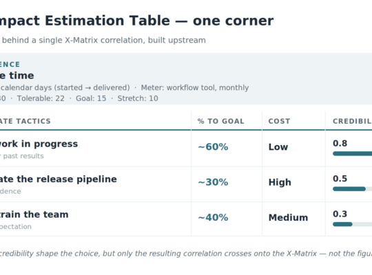
Tom Gilb’s Impact Estimation Tables and the X-Matrix have different heritages, yet one can quietly inform the other’s correlations. Here’s how.

Four lenses — system, variation, knowledge, and psychology. Deming’s System of Profound Knowledge, and how it informs Strategy Deployment.

Nicolas Cage films and ice cream sales reveal something important about X-Matrix correlations and the gap between leading and lagging measures.

The primary value in an X-Matrix comes from collaboration. However, there will be a need for communication. One powerful way is through strategic storytelling.

A further reflection on Richard Rumelt’s The Crux, and how it relates to Strategy Deployment and the X-Matrix’s True North.
Find out how to identify your organisational True North with the AIM framework and a simple process that enhances alignment, motivation, and strategic clarity.

One of my main influences in the field of Strategy is Richard Rumelt. After referencing Good Strategy / Bad Strategy, I am now being inspired by The Crux.

A True North is a shared story that people should be able to connect to, that resonates with them, and that articulates a real sense of purpose and direction.

What is the relationship between OKRs and the X-Matrix? The answer lies in recognising the difference between Strategic and SMART objectives.

Jim Benson and I will be at Kanban Edge on March 6th in London and are teaching our Making Strategy Visible workshop again the day after the conference.