The Sankey Diagram can be a simple but powerful technique which can complement, and possibly enhance the X-Matrix. This post will show how.
What is a Sankey Diagram?
A Sankey Diagram is a visualisation technique which shows the flow between nodes. The link widths usually represent the magnitude of the relationship, and colour can also display other attributes. It’s named after Matthew Henry Phineas Rile Sankey who used the style in his 1898 diagram (on the right) showing the thermal efficiency of a steam engine.

How it can be helpful?
I first came across the Sankey Diagram from Troy Magennis who uses it in one of his spreadsheets to show the flow of work from strategies, to work, to teams. This is an example of his:

I find this visualisation extremely powerful and have recently been using the approach as a complementary technique alongside the X-Matrix.
A Simple Example
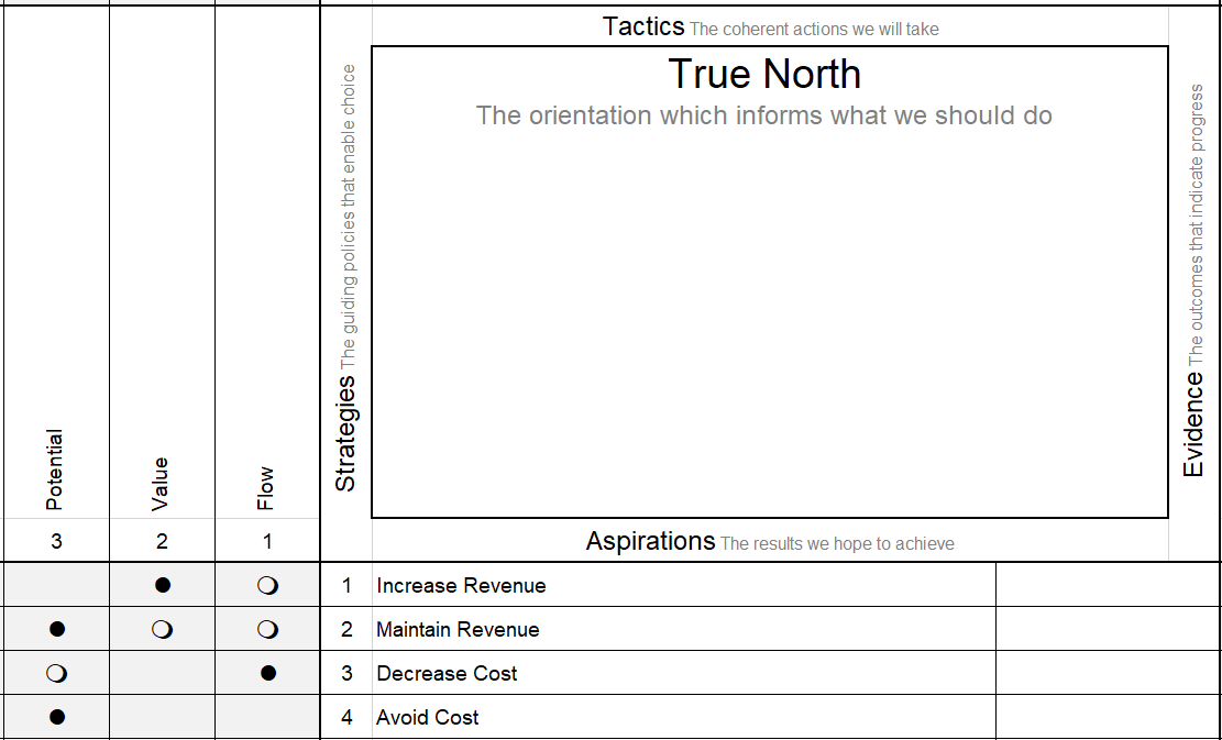
One of the powerful aspects of the X-Matrix is its ability to show all the elements, and the messy coherence between them, of the TASTE model for Strategy Deployment. However, the downside is that there is a lot to take in, and it can be overwhelming. A simple solution is to present each corner of the matrix separately (i.e. each corner matrix). Thus there opens up the possibility of visualising those separate relations more simply as well. Consequently, the Sankey Diagram becomes a useful approach.
Using the example of Aspirations and Strategies from a couple of recent posts, I have created an example shown on the X-Matrix as below. In doing so, I have suggested some plausible relationships between them with the typical full and empty dots. A full dots represent a strong and direct contribution of a Strategy to an Aspiration. Similarly, an empty dot represents a weak or indirect contribution of a Strategy to an Aspiration.
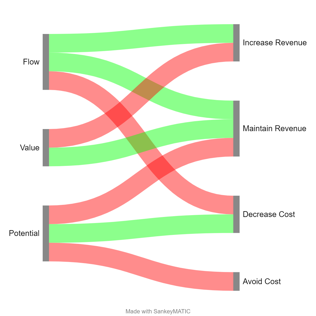
Converting this into a Sankey Diagram gives us the following (generated with SankeyMATIC). The dark red link is the equivalent of the strong and direct full dot. The light green link is the equivalent of the weak and indirect empty dot. I could also have used the width of the links to show relative strength and directness, and colour to represent the originating Strategy.
Future Potential
This opens up the possibility of visualising a full X-Matrix as a Sankey Diagram, with links instead of dots. It is possible for Sankey Diagrams to be circular and show loops. However, that’s not somethng I’ve explored in detail yet. The generators I’ve looked at so far don’t look like they will make it easy to get the right layout and the effort might outweight the benefit. I’d love to be proved wrong though!