 At the start of the year Mike Burrows posted about an idea he called Reverse Wardley, with some background to where it came from. As one of the sources of the idea I thought I should say some more about my thinking that led to it. Mike has also called the approach Option Visbility, and in writing this post I am preferring the name Option Orientation. Taking a set of existing options, and orientating oursleves with them such that we know how we should move next.
To explain the origins, lets first make a disctinction between sensemaking and categorisation.
- Sensemaking is where the data precedes the framework. We position a set of data in a blank space, and then draw lines around it.
- Categorisation is where the framework precedes the data. We draw lines in a blank space, and then position data between the lines.
Cynefin is intended to be a sensemaking framework, and exercises such as Four Points Contextualisation are designed to use it this way by placing items on a blank canvas, relative to the four corners, before any lines are drawn around them. The question that seeded the creation of Option Orientation is whether we can consider a Wardley Map to be a form of categorisation, in that data is added to a pre-defined evolutionary framework? And if it is, what would it look like to use a Sensemaking approach to create a Wardley Map? Hence the original name Reverse Wardley.
I should be clear that I am in no way saying that Wardley Mapping needs improving. Nor am I suggesting that sensemaking is any way superior to categorisation. Both are equally useful in context. These were just thoughts that occurred to me while listening to Dave and Simon talk at their “Snowden/Wardley Masterclass” last December.
I voiced these thoughts and discussed the questions with Liz Keogh, who came up with the idea of integrating with Agendashift. As I posted in the Agendashift Slack channel which Mike’s post references.
Liz and I have just figured out how to use Wardley Mapping to create the Transformation Map. Muwahahaha.
The basic idea is to take the FOTO outcomes that get used in 4-Points, and re-use them in a Wardley Map, so the Transformation Map is more of a Wardley Map than a Story Map.
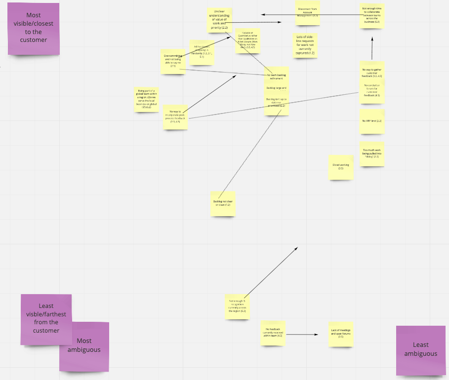
Vertical axis is “distance” from the customer.
Horizontal axis is ambiguity of solution (which may or may not relate to the Cynefin domains)
I recommend reading Mike’s post for his interpretation of that quote and how he applied the thinking.
Here’s the way I have facilitated it.
- Rather than starting with a Blank Wardley Map and add the items starting from the top of the valeu chain (i.e. most visible) down, we start with a blank canvas, and an existing set of previously generated items (e.g. Agendashift outcomes)
- The items are first moved onto the hoizontal axis in order of relative ambiguity. First I’ll ask for the most abmigious to be placed furthest left. Then for the least ambigious to be placed furthest righ. Then another random item to be placed relatively inbetween. Then another, and so on, until all have been placed realtively.
- The items are then moved vertically in order of visibility to the customer (which can generate a good discussion about who that is!). First I’ll ask for the most visible to be placed highest up, keeping its horizontal postion. Then for the least visible to be placed lowest down, still keeping its horizontal placement. Then another random item to placed relatively, and another, and so on, always maintaining the horizontal placement.
Now we have an Option Orientation Map such as the one below, which was generated with a Miro (aka Realtime) Board. Sorry that its (intentioanlly) not readable. The details are client specific, and it’s the overall look and effect that I hope is more useful.

Given something like the above we can now ask some questions about it:
- Which items would we like to move up/down/left/right? We can annotate this on the map with arrows to show desired movement.
- How do the items relate to each other? We can draw links between items to show relationships.
- Which items should we choose to work on? We can circle and name important groups or themes.
Thus the map gives us the context to make some strategic decisions on what needs to be done next as part of a continuous transformation effort, and can be revisited over time to re-align and renew direction.

Possibly this could compliment my approach here: https://medium.com/@siliconglen/strategy-maps-bcb81b0dea49 with a template here https://medium.com/@siliconglen/strategy-map-template-ceaa710c79 in order that when you have decided what do first or next, you can then map this against how this shifts you towards favourable outcomes and when it might happen. I felt that come customers were struggling a bit with Wardley and how to translate this into a meaningful roadmap with high level dates. Hope this helps, thanks for the blog post!
Craig
Thanks Craig. Looks useful.