I’ve been doing the rounds of conferences and meet-ups recently, introducing the Kanban Canvas as a way of becoming a learning organisation. One of the more common requests and pieces of feedback is that an example would be useful. I have mixed feelings about this. On the one hand, giving an example feels like a slippery slope to giving a solution, and brings with it he risk of unconsciously narrowing the field of vision when looking for new answers. On the other hand, its come up often enough not to ignore!
I’ve decided put together a very simple example. Hopefully too simple, and simplistic, to be copyable, but concrete enough to help show how the canvas could be used. Its based on the experience from when I introduced a kanban system at Yahoo! I have taken some liberties in putting it together to keep it understandable – we didn’t formally use this approach, and it was a long time ago!
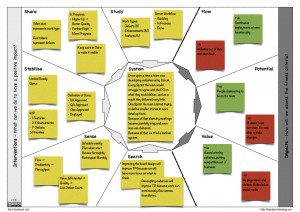
Click on the image to see a larger version. I have added some commentary about the different elements below.
System
I have described the systemic challenge using the Pixar Pitch format (deferring the ‘Until finally’ to be covered by Impacts). It could be summarised by the the headline “Busy, Not Productive”
Once upon a time a team was developing websites using Scrum
Every Sprint the team would struggle to agree with the PO on what they could deliver, and as a result they delivered very little.
One Sprint the team started trying to define smaller stories in more detail up front.
Because of that planning meetings became painfully long, and even less was delivered.
Because of that we tried a kanban system.
Impacts
There is a single utopian and dystopian future for each Impact, using colour to differentiate. Utopian positive (+ve) impacts are green. Dystopian negative (-ve) impacts are red.
Flow
These are related to being able to release functionality early and often
- +ve: Continuous deployments of new functionality
- -ve: Websites broken, out of date and shut down
Potential
These are related to being a stable and high performing team
- +ve: People clamouring to be on the team
- -ve: Massive team turnover. No-one able to make changes.
Value
These are related to being able to build the best product
- +ve: Award winning websites, putting competition out of business.
- -ve: No page views or visitors. Ridiculed on social media.
Interventions
Study
We identified 3 types of work; defects in production, enhancements to released functionality, and new features. These were generally equated to small, medium and large pieces of work.
We were following a basic Scrum workflow of Backlog, In Process, and Done.
Share
To share the work type, we used token size. Defects were on small index cards, enhancements on medium, and features on large. Additionally, token colour differentiated failure and value demand. Defects were on red cards, whilst the others were on green cards.
To share the status of work in process, we used token placement in a matrix to represent progress and quality. The horizontal placement showed progress, while the vertical placement showed quality. Thus a token in the lower right corner was nearly finished, but with unsatisfactory quality.
Completed work was kept visible by keeping its token placement in a Done column until then end of a quarter.
Stabilise
We replaced the backlog with a limited “Ready Queue” to help clarity on what the next priorities were. (This queue would be restocked every week).
Work in Process was limited by work type, focussing on only 1 feature and 2 enhancements at a time. Defects were not limited, but the goal was always to eliminate defects rather than optimise them. Additionally, there was a “Top 5” work items to focus on, which could be of any work type. (We had 5 “star” adornments as token inscriptions to share what the top 5 were).
The goal was to get work into production, so our Definition of Done policy was simply that work must also be approved by the UX, QA and Ops teams and actually deployed and available.
Sense
The primary desired impact was Flow, with an outcome of improved productivity being a indicator. This was quantified by measuring throughput of items per week, with an increase being the goal.
A risk, however, was that cutting quality, or optimising for defects, could be a negative consequence of focussing on throughput. This would badly impact both Value and Potential. Thus a count of live defects was also measured, with a decrease being the goal.
The traditional scrum cadences were de-coupled with a new set of cadences put in place:
- Weekly scheduling meetings to restock the ready queue
- Planning meetings on-demand when work actually starts
- Fortnightly review meetings to check progress
- Monthly retrospective meetings to insect and adapt the process
Search
While experiments were not formally run, there were essentially 2 hypothesis being tested. The first was related to the board design, visualising and focussing on the work types. The second was related to the de-coupled cadences, with work flowing across them.
Wrapping Up
I hope this example shows how the canvas can be used to tell a simple story about what the elements of a process are (the interventions), their context (the system), and their goal (the impacts).
If you’d like to use the canvas, please download it. And if you’d like me to facilitate a workshop which uses the canvas to design your kanban system, then please let me know.


[…] A Kanban Canvas Example […]
[…] A Kanban Canvas Example (Karl Scotland) […]